STORY BY SANDRA S. SORIA ✷ PHOTOGRAPHS BY DAVID ENGELHARDT
When Patrick and Kanitha bought this 1970s house a couple of years ago, it was in dire need of a design rescue. Clearly, they were the right owners for the job. “That’s what we do,” Patrick says. “We design and build places for people and from time to time do our own thing.”
As CEO (Patrick) and COO (Kanitha) of the design-build firm Alpha Genesis, their thing is to lead clients through both the design and building phase of home construction—from pencil sketches to architectural plans to zoning technicalities to construction. Clients sign a single contract, then an integrated team makes it happen.
Once considered an alternative approach to home construction, design-build is gaining traction, and several industry studies indicate it will be the most popular approach to home projects within a couple of years.

Patrick and Kanitha are a team well-suited to accelerate the trend. “Basically, our work is broken out into two major parts,” Patrick says. “I handle client development—getting work—and direct creative. Kanitha manages the business—making things run smoothly, like documents, legal, financial—the really important and hard things. I am just a dreamer who went to school for music, but Kanitha really makes shit happen.”
From a style perspective, however, they’re on the same page. So, when they bought the mountain home as a primary residence for their family of four, they knew what needed to be done—a gut job. “It was totally different than what you see here,” Patrick says. “The rooms were chopped up, so we needed to sort out the layout, and the overall style was kind of French provincial—like porcelain chickens and brick floors.”
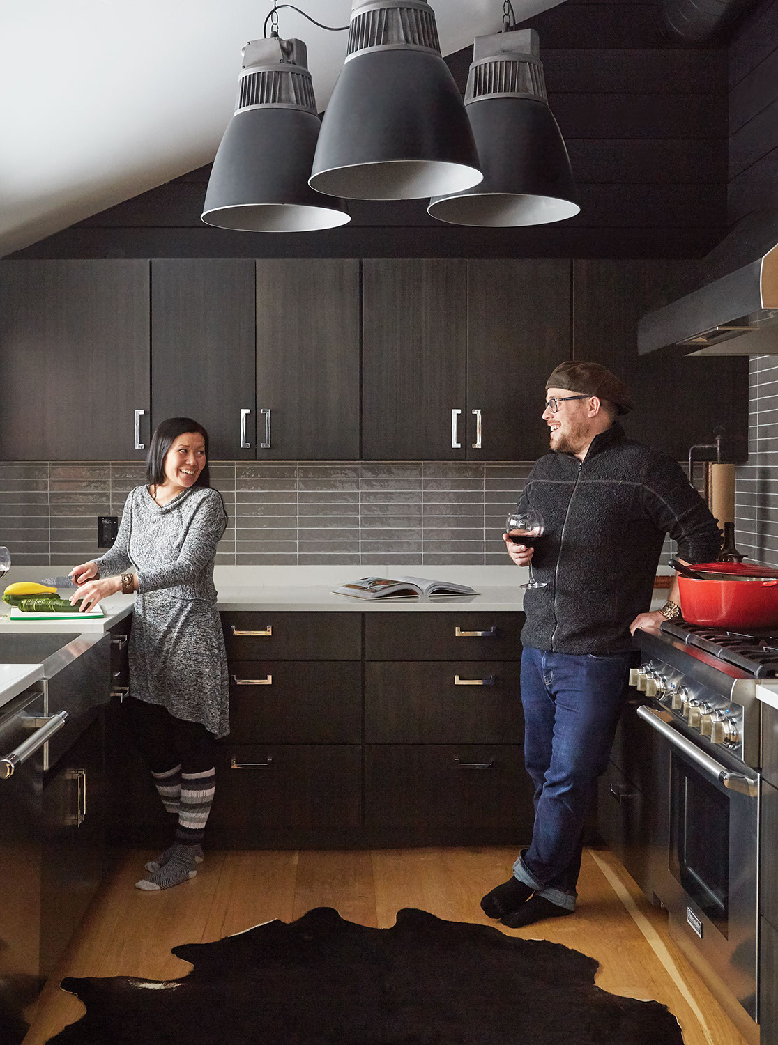
When they were finished, walls had tumbled and traffic flow was smoothed, ceilings were lifted, the chickens were long gone, and the vibe was sophisticated but cozy. “For our own take,” Patrick says, “Kanitha and I like homes that are very textured. They’re intimate, sexy, there are always layers. It’s very much like a three-piece suit. There’s a jacket and the vest and the shirt and the bow tie. There’s a sense of warmth that comes with adding layers.”
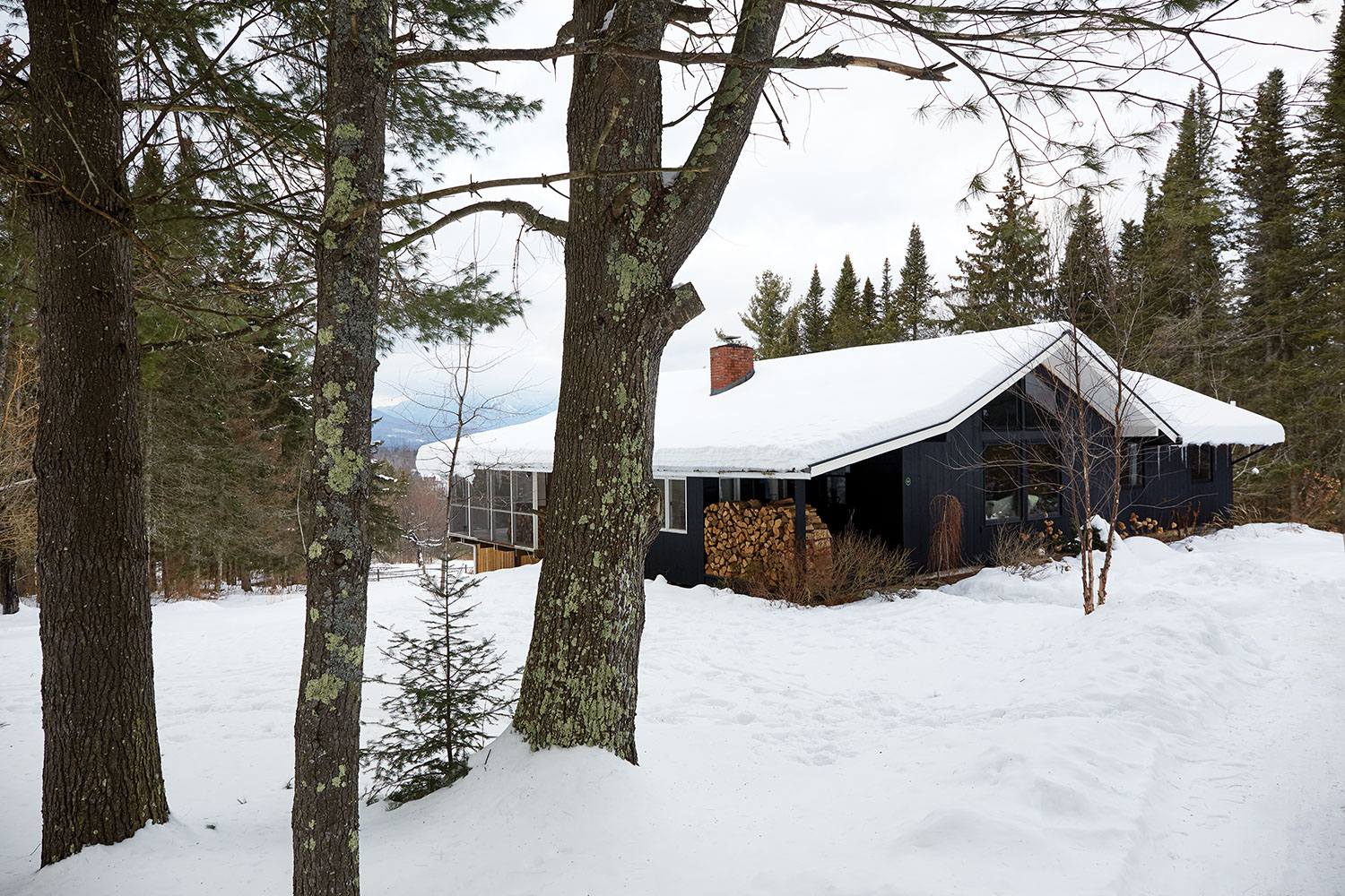
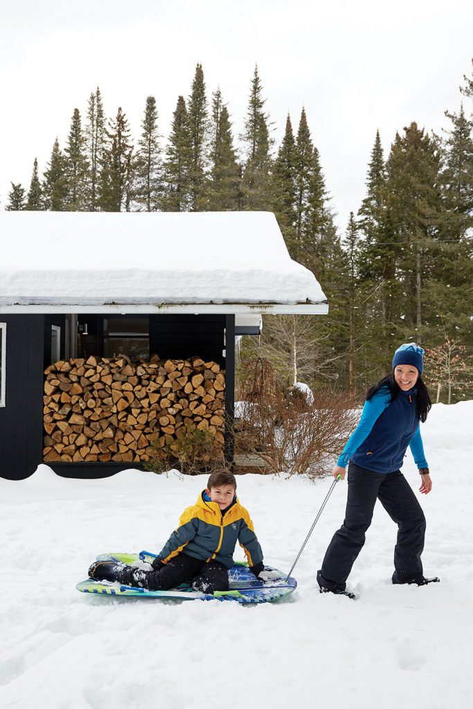
Key to their chic cocoon is the generous deployment of black, both inside and out. “We always tend to go black, especially on the exterior,” Patrick says. “If you’re in a wooded environment, it disappears against the trees. It’s gone—like a phantom house.”
Black Is Like A Tuxedo—It Looked Good 100 Years Ago And It Still Looks Good Today.
– Patrick Pastella
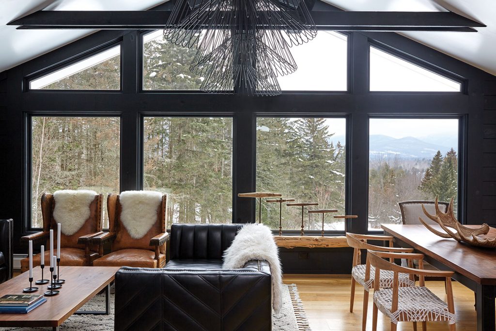
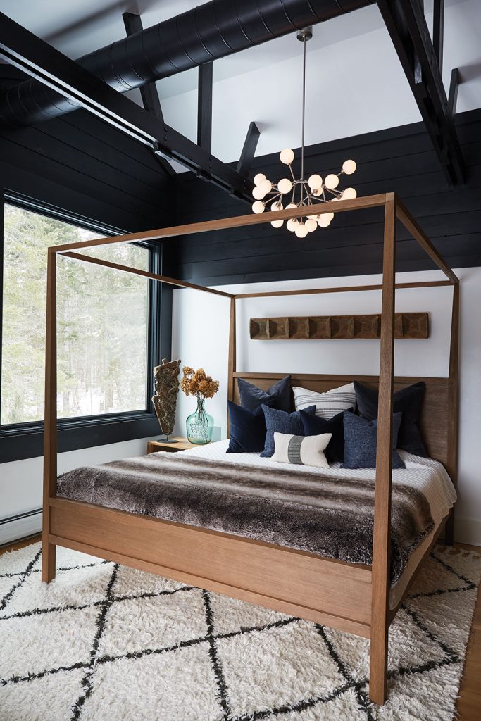
Inside, the classic shade spotlights views to the outside like a frame on a painting, turning their mountain vistas into focal points. Black also adds a richness and unmistakable drama. “Black allows you to do really incredible things with backdrops and scenery,” Patrick says. “And any piece of artwork you put on a black backdrop, if it’s appropriately lit up, looks better than on white, in my opinion.”
Lighting is a key player in the couple’s style. It is functional art—modern sculpture that also pulls its weight as a practical element. Really, why just illuminate a hallway when a progression of modern globe pendants turns it into a memorable passage? And why hide light sources in the ceiling when you can crown a space with knock-out wire fixtures? “They’re three feet tall,” Patrick says. “They’re way oversized for the space but I was just like, fuck it, they’re so great. Because you walk into this little house on the side of a mountain in Vermont and you just don’t expect to see these things hanging from the ceiling. I think that’s cool.”
Making bold choices—even bending design rules—also turns their own spaces into design labs. They do the experimentation so that when working with clients, ideas are tested and solid. “We aren’t timid with design,” Patrick says. “We try a lot of stuff before we suggest it for other people. We’re willing to take risks and make mistakes for ourselves, but we really don’t want to make mistakes for someone else.”
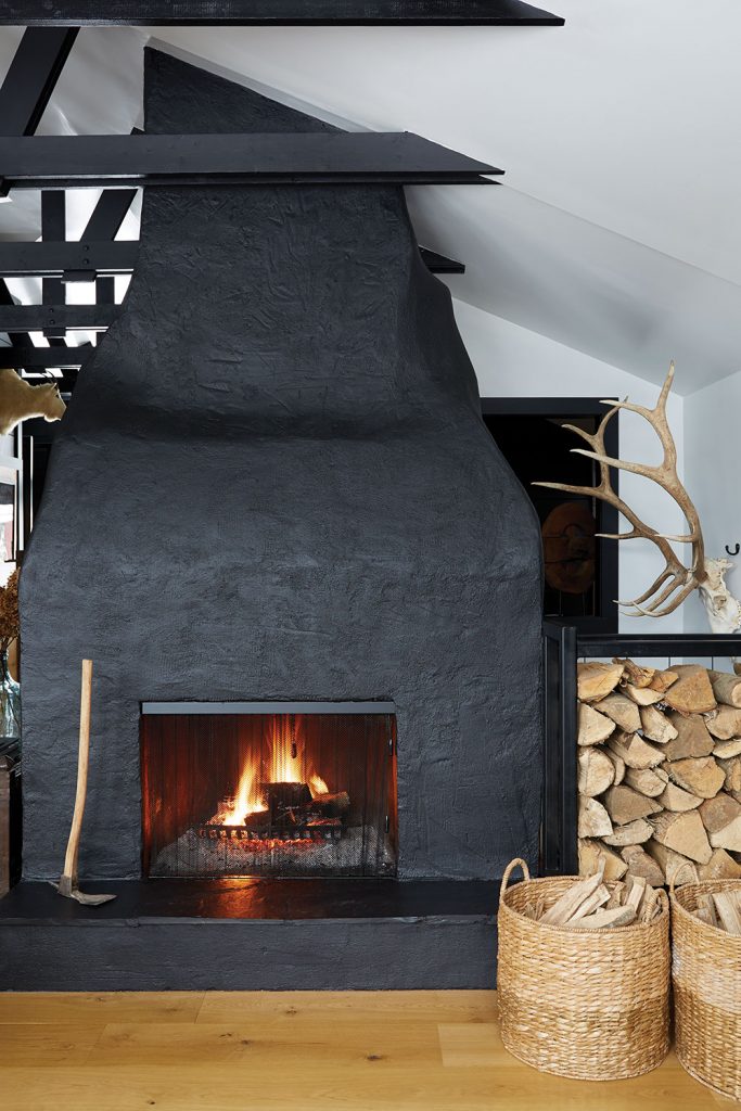
Their most successful experiments come from finding creative solutions to what Patrick calls “liability of design,” where something is off either functionally or visually. The striking black fireplace that anchors the living area is a case in point. Once a hulking visual roadblock cobbled of brown brick and drywall, Patrick and Kanitha decided to take it apart, stripping it down to cinder blocks and flue. “That’s when we realized whoever built this thing had no idea what they were doing,” Patrick says. “They had clearly never stacked cinder blocks before. It was an amoeba shape.”
The two went with it, covering the crooked structure with wire and masonry mix painted black. “We created a natural, organic shape,” he says. “It’s like someone took a piece of Play-Doh and started mushing it into a fireplace. But we think it’s kind of neat.”
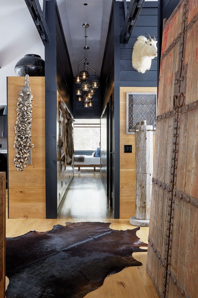
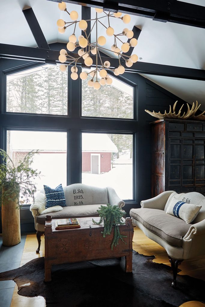

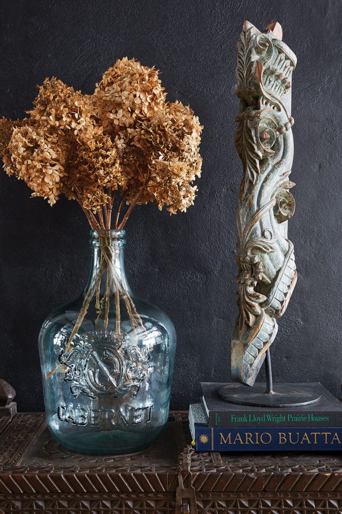
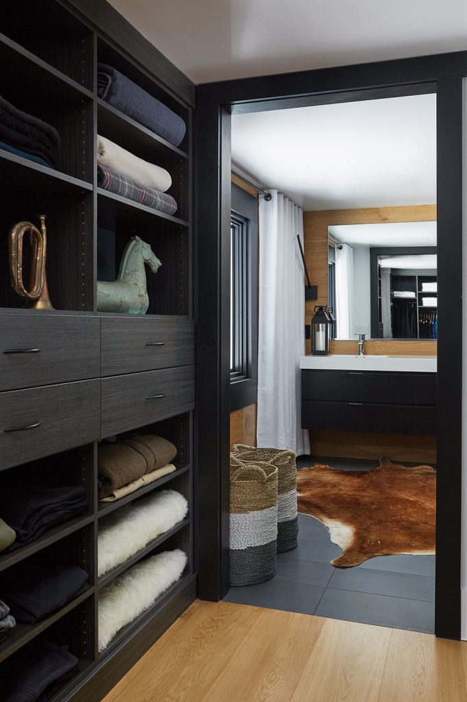
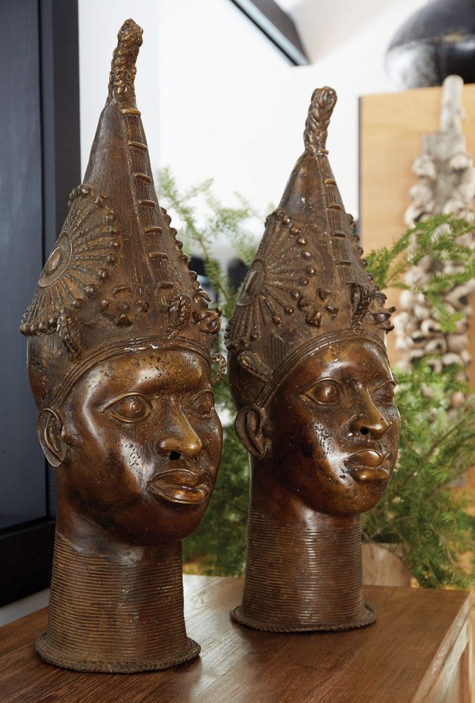
Vintage and found furnishings populate the interiors, selected for form and function to be sure. But the stories they tell also factor in. The vintage leather armchairs in the great room check all those boxes. “These are 1920s French parlor chairs with bullion on the arms—such a super cool find,” Patrick says. “They still smell faintly of cigars. I mean, there’s a story in those chairs. I’m sure we don’t all need to hear about it, but whatever it is, they had a good life and they bring that character here.”
Creative solutions, bold design choices, and storied furnishings come together in a home that stands up to an active family with two young boys and to a chilly Vermont winter. (No-VOC soy-based spray-foam insulation and energy-efficient windows lend a hand with the latter.) And it’s a visually striking environment thanks to the fearless and decisive design duo who forged it. “We take an unapologetic approach,” Patrick says. “We don’t really care what the neighbors say. We’d rather go for that thin mark, where you either love it or hate it. But when you love it, you really, really love it.”
Check out alphagenesisdesign.com.

